Winter Colors for Children 2026: The Soft and Deep Palette That Stands Out
This publication is also available in: ![]() Français
Français ![]() Deutsch
Deutsch ![]() Italiano
Italiano ![]() Español
Español ![]() English (US)
English (US)
Winter no longer screams. It envelops. In 2026, the colors of childhood shift from the spectacular to reconnect with a gentle, reassuring, and lasting gravity.
Each season silently reshapes the contours of children’s wardrobes. Winter 2026 is no exception, but it marks a clear inflection: fewer bright contrasts, fewer “signal” colors, more deep, muted, almost tactile shades. This chromatic shift is not just an aesthetic whim. It reflects a broader evolution in the perception of childhood, which has become more attuned to slow rhythms, sensations, and long-lasting time.
As children’s silhouettes simplify, color becomes a central issue. It must be beautiful, of course, but also bearable in daily life, easy to pair, and capable of transcending several seasons without becoming tiresome. In a winter where light fades early and the need for visual comfort intensifies, the observed palettes favor continuity over disruption, enveloping rather than stimulating.
Inspired by minerals, earth, and natural fibers, these colors engage in dialogue with the cold season without succumbing to it. They create a coherent, serene, almost silent visual landscape, where the child remains at the center — never disguised, never overloaded. Decoding a palette that asserts itself not through fashion trends but through evidence.
When winter calls for reassuring colors
Winter imposes its own constraints: shorter days, low sun, alternating between dry cold and humidity. The children’s wardrobe, more than any other, must adapt to this. Bright colors, long used to “wake up” the silhouette, show their limits in this context. Too contrasting, they tire the eye, quickly saturate the visual space, and struggle to endure over time.
In contrast, reassuring colors function as a calm background. They absorb light rather than reflect it directly, creating an immediate sense of balance. This chromatic approach accompanies daily gestures: getting dressed in the morning without friction, layering without dissonance, moving smoothly from indoors to outdoors. The shades chosen for winter 2026 thus contribute to a form of overall comfort, both visual and sensory.
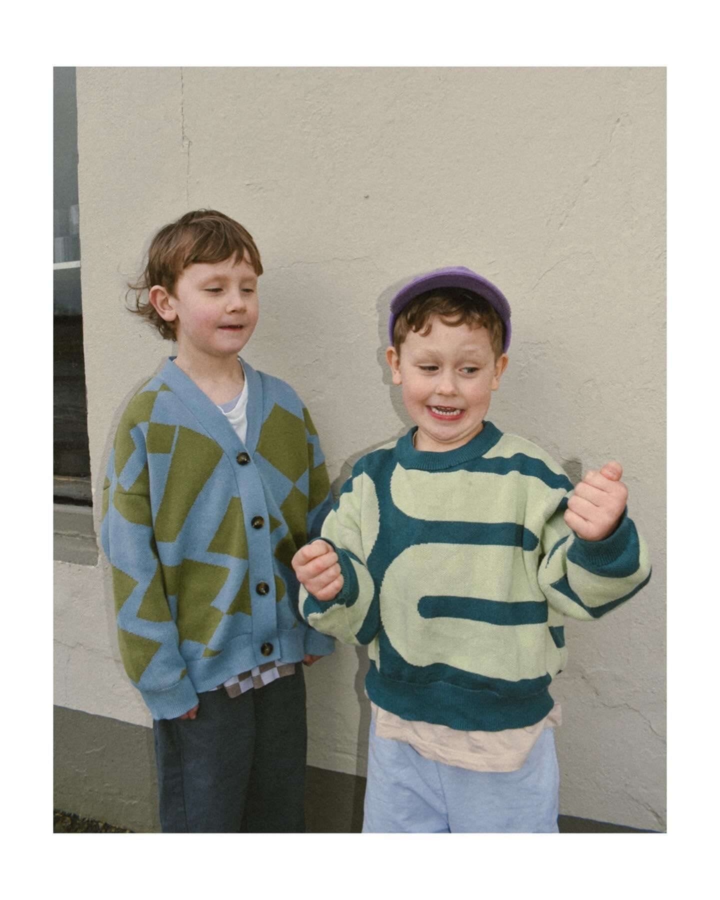
Warm browns and ecrus: the return of organic elegance
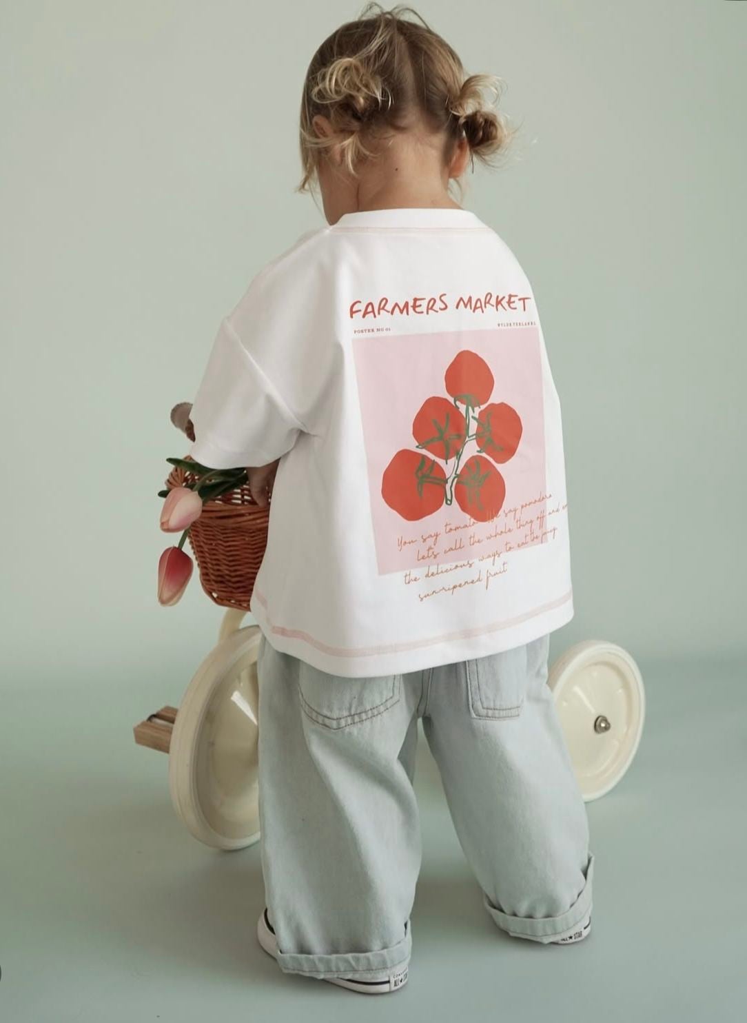
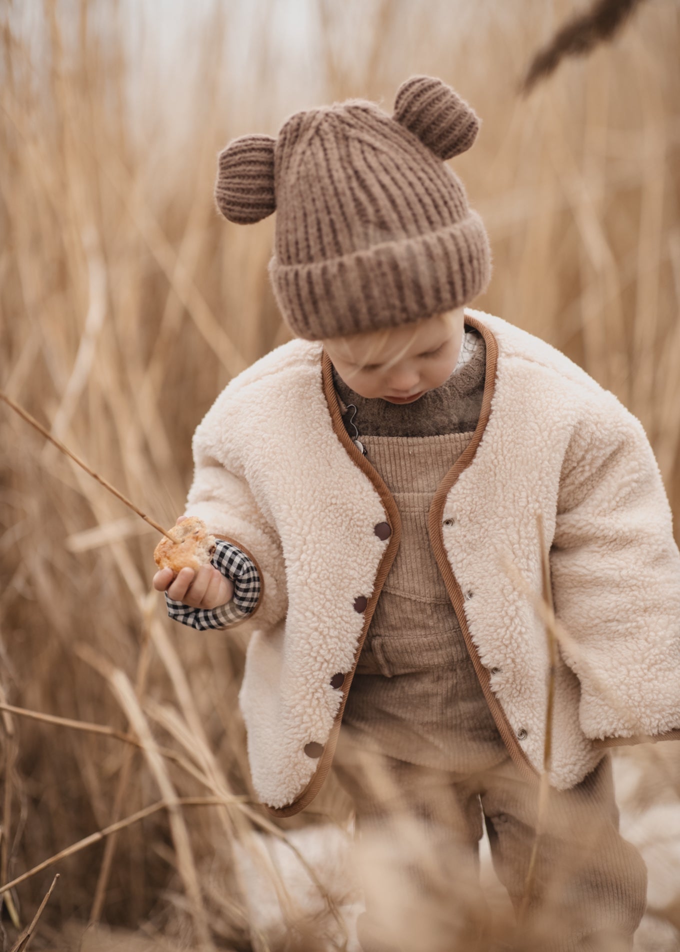
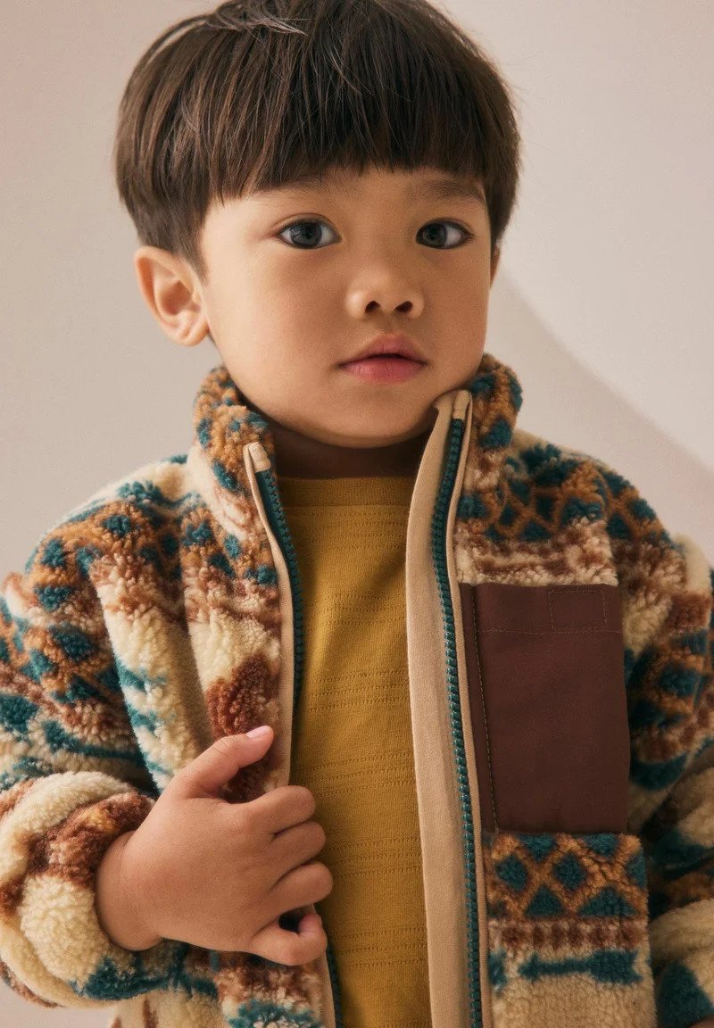
Among the dominant shades, warm browns assert themselves naturally. Soft chocolate, hazelnut, cinnamon, patinated terracotta: these hues evoke soil, wood, thick wool, winter landscapes stripped of greenery. They immediately warm a child’s silhouette without ever hardening it, provided they are paired with simple cuts and breathable materials.
The ecrus play a crucial complementary role. Far from bright white, they come in ivory, cream, raw linen, sometimes slightly grayish. Their visual softness captures the winter light and softens the entire wardrobe. Used in total look or in touches — a knit, a lining, a scarf — they allow for subtle, always coherent combinations. Together, browns and ecrus create an organic, warm elegance that anchors the garment in material and reality.
Stone gray and muted greens: the new neutrality
Winter 2026 marks a clear shift in so-called “neutral” colors. Black and cool blues, long dominant, give way to more nuanced tones. Stone gray, slightly warm, almost mineral, structures the silhouettes without freezing them. It serves as a reliable base, capable of unifying an entire wardrobe, from coats to trousers, including thick knits.
Alongside, muted greens — sage, moss, grayish olive — provide a discreet breath. Inspired by winter vegetation, they evoke persistent foliage, silent landscapes, and underbrush. Neither too dark nor too present, these greens offer an elegant alternative to colors traditionally associated with childhood. They introduce depth without breaking the overall harmony and facilitate natural combinations with browns, ecrus, and grays.

Colors designed to last, not to shine
What truly distinguishes the winter 2026 children’s palette is its ability to withstand the test of time. These colors do not seek immediate effect or instant recognition. They are designed to be worn, reused, and sometimes passed down. Their strength lies in their discretion: they accompany evolving morphologies, clarifying styles, and the diverse uses from one winter to the next.
In a logic of a considered wardrobe, these shades facilitate the construction of cohesive outfits with a limited number of pieces. They interact effortlessly, reducing the need for constant renewal. Color then becomes a foundation, a point of anchorage around which the entire winter wardrobe is organized. An approach that prioritizes visual and emotional quality over quick novelty, and that gives children’s clothing a more rightful, more sustainable place.
Winter 2026 shapes a calmer, more grounded childhood, less subject to the urgency of novelty. Through these muted and deep colors, the children’s wardrobe becomes a familiar, stable, almost reassuring landscape. Warm browns, luminous ecrus, stone grays, and felted greens compose a palette that accompanies the season with accuracy, without ever forcing it. A discreet yet assertive way to dress children in harmony with winter — and with long-lasting time.